We have a new logo! Like anyone with a new love, we want to talk about it. But, rather than bore you with flowery descriptions, and our not-unbiased opinions, I thought you’d be more interested in seeing the process we went through. After all, it’s not every day you get to see the birth of a logo!
The designer

We were fortunate to snag the services of the very talented Katherine Yamasaki, who generously volunteered her time to help with this and out website redesign project. Katherine is looking for new challenges in her life, after an extensive career in graphic design. So we feel blessed that she was willing to take on what is, after all, another routine graphic design project.
The process
We never talked about it, but as it turned out, we followed a standard design process. Full disclosure: most of us had extensive design backgrounds. So we went through the phases of Definition, Ideation (three rounds), Refinement, Testing, Revision, and Finalizing.
The project took about two months, end-to-end. We had the final concept worked out in about two weeks, tested for a week, explored revisions for another week, and then spent a leisurely month finalizing nit-picking details. It stills feels as though we hit just the right balance of exploring new ideas and chasing rainbows.
Defining
The first thing we did was to think about what we wanted in a logo. That resulted in this moodboard, which capturing some things we were drawn to, specific requirements, and examples of what we didn’t want:
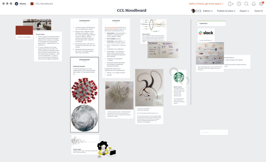
Before you strain your eyes, this is what the “requirements” notes say:
Constraints
- It should be simple. (Something that even I can approximate quickly.)
- Needs to work in different formats (website, print materials, t-shirts, etc.) There might be slightly different versions to adapt to different constraints and opportunities, but there should be some consistent core element.
- Should work in grey-scale, and not use more than two colors. One color is better.
- Should work with and without the CCL name. (I’m thinking a graphic rather than a wordmark.)
Concepts
The memes & themes document has a dump of some concepts to draw on. At this moment, these jump out at me:
- Improvisation, crisis, spontaneity — asymmetry, something broken coming together, healing
- Force multiplier, diversity
- Community, social resilience — a unified whole, more than one part
- Crisis – jumbles letters? maybe too busy
- Leadership is not a single hero
- simple graphic – with meaning. It doesn’t need to say everything. Supporting tagline and usage with other materials
- “preparing to be unprepared” — training
- spontaneous leaders [Spreading social resilience. Empowering spontaneous leaders.]
Concepts that could be more impressionistic than representational:
- Gaming — fun, creative, inventive
- Scientific
Ideation
Three days after our kickoff meeting, Katherine came back with these sketches:
The team, which at this point consisted of Dinçer Parker (also a strong graphic designer) and myself, found these three particularly appealing:


Katherine returned a few days later with these sketches:
The team, now with the addition of Nate Digre (yet more graphic design experience), found these ideas worth pursuing:


As you can see, we were clearly drawn to the inverted “c,” putting Leadership in the center, the rounded shape, and the wispy brushstroke. (If you look back at the moodboard, you can see that some of these elements were already there — crescent shapes, flowing lines, and the concept of something subtly wrong.)
Katherine explored these ideas in the next few days, but then also came back with some comparative research:
We had three strong winners, and signs of a clear concept:


Refinement
Katherine then took the base concept and started exploring how it would work as a full logo, with the name. You’ll note that, up until now, Katherine is working on paper. Going into Refinement, she has gone fully digital, and, consequently, has to explore typography in a serious way:

Testing
At this point, we recognized that we not only were too invested in the ideas, but also starting to getting mired in nit-picking details that weren’t critical. We were lucky to recruit Adriana Orland and Kyle Brown, both early-career UX researchers, to help us with testing.
We knew we were looking for a simple test, just getting first reactions and impressions. So the first we did was narrow down what we actually needed to test. That led us to settling on one version of the icon, and four alternatives on of the name. The latter were variations of casing (title or all caps) and whether the name was presented on two or three lines:
![]()


UsabilityHub kindly extended us a free license. Kyle and Adriana set up a short self-administered test and sent out recruiting messages over their wide professional networks. Over 3 days, they collected 38 responses. This was the clear favorite:

Other results were all that we could hope for. That is, not overwhelmingly positive.
Specifically,
- The top reactions to the icon: artistic, dynamic, modern. We were happy with dynamic and modern, but not artistic.
- Conjectures about what the company does included consulting firm, design firm. Again, not what we were looking for. (But not surprising given the heavy design-orientation of the team!)
- Respondents also found the colors too dark, “conflicts with hopeful message in mission statement”
- Several people commented on the drama of the lines, which we reformulated as too much contrast between wispiness of semi-circles with blockiness of the L
- Finally, several people mentioned the blocky L as being difficult to interpret
Revision
We were ready to take the insights from the testing, and adjust the design that was emerging. But, Katherine decided to step back and do conduct a thorough comparative analysis. She looked at organizations with similar interests (disaster, leadership, etc.) as well as examining logos that employed different shapes than the circular direction we were adopting:
This was a very valuable exploration, and, if anything, made us appreciate the simplicity and balance of the direction we were already taking. So Katherine set off on a final round of ideation, exploring different ideas for addressing the concerns brought out in the testing:
Once again, the team (now including Kyle and Adriana, but without Dinçer) had a clear favorite:
![]()
Finalization
Katherine now did some final adjustments of the shape and lettering, and set about exploring colors:
And came up with four final options:
Where, again, there was a clear winner:
![]()
The result
So, with the minute adjustments that are always needed in any design, here is our new logo in color and black and white versions:
![]()
![]()
![]()
Reflections
First, thank you, Katherine Yamasaki, for an amazing job! And thanks to everyone who contributed their thoughts and insights along the way, especially Nate, Kyle, Adriana, and the 38 anonymous people who provided us with their honest reactions.
Second, a confession: I started this process thinking that I absolutely wanted something pictorial that wasn’t based on a wordmark or letters. So I was skeptical when Katherine brought back her first ideas. However, I didn’t want to stomp on any artistic expressions, especially this early in the process and working relationship, so I bit my tongue. Hard.
Then, to my surprise, I started to fall in love. Right here:
I am now head over heels, and thankful that I stayed silent.
PS
As a bonus, we all fell for this little gem immediately, in Katherine’s first round of ideas. Expect to see variations in our future materials!

0 Comments